1/6


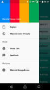
Material Design Color
1K+Tải về
2.5MBKích thước
4.0(17-04-2021)Phiên bản mới nhất
Chi tiếtĐánh giáPhiên bảnthông tin
1/6
Mô tả của Material Design Color
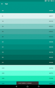
Màu:
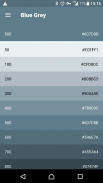
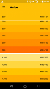
Màu sắc trong thiết kế vật liệu được lấy cảm hứng từ màu sắc đậm juxtaposed với môi trường tắt, bóng tối sâu, và điểm nổi bật sáng.
Các bảng màu:
bảng màu này bao gồm các màu cơ bản và giọng mà có thể được sử dụng để minh hoạ hoặc để phát triển màu sắc thương hiệu của bạn. Họ đã được thiết kế để làm việc hài hòa với nhau. Các bảng màu bắt đầu với màu cơ bản và điền vào quang phổ để tạo ra một bảng màu hoàn toàn và có thể sử dụng cho Android, Web, và iOS. Google gợi ý sử dụng 500 màu sắc như các màu cơ bản trong ứng dụng của bạn và các màu sắc khác như điểm nhấn màu sắc.
Được thiết kế bởi Eajy ở Trung Quốc.
Material Design Color - Thông tin APK
Phiên bản APK: 4.0Gói: com.eajy.materialdesigncolorTên: Material Design ColorKích thước: 2.5 MBTải về: 143Phiên bản: : 4.0Ngày phát hành: 2024-05-30 15:46:27Màn hình tối thiểu: SMALLCPU được hỗ trợ:
ID gói: com.eajy.materialdesigncolorChữ ký SHA1: 46:0C:C4:69:63:B6:51:25:41:82:49:DE:1D:94:6A:85:78:0A:B6:7CLập trình viên (CN): EajyTổ chức (O): Địa phương (L): Quốc gia (C): 86Bang / Thành phố (ST): ID gói: com.eajy.materialdesigncolorChữ ký SHA1: 46:0C:C4:69:63:B6:51:25:41:82:49:DE:1D:94:6A:85:78:0A:B6:7CLập trình viên (CN): EajyTổ chức (O): Địa phương (L): Quốc gia (C): 86Bang / Thành phố (ST):
Phiên bản mới nhất của Material Design Color
4.0
17/4/2021143 tải về2.5 MB Kích thước
Phiên bản khác
3.9
8/6/2020143 tải về2.5 MB Kích thước
3.8
28/2/2020143 tải về2.5 MB Kích thước


Ứng dụng cùng danh mục

Bạn cũng có thể thích...

English


